Within the dynamic realm of web development, Angular emerges as a standout framework renowned for its exceptional strength and flexibility. Its solid foundation and comprehensive suite of tools have enabled developers to craft beautiful, agile web applications with relative simplicity. The Date Range Picker, a gem within Angular’s vast arsenal, plays a pivotal role by providing user-friendly date selection features essential for a wide array of applications.
This article takes you on an exploration of the sophistication and practicality found in the Pure Angular Date Range Picker. Crafted for flawless integration with Angular projects, this component stands as an elegant answer to the need for effortless date range selection. Whether it’s for coordinating appointments, overseeing reservations, or scrutinizing patterns in time-sensitive data, the Pure Angular Date Range Picker supplies developers with an advanced set of capabilities to improve user interaction and optimize the efficiency of their processes.
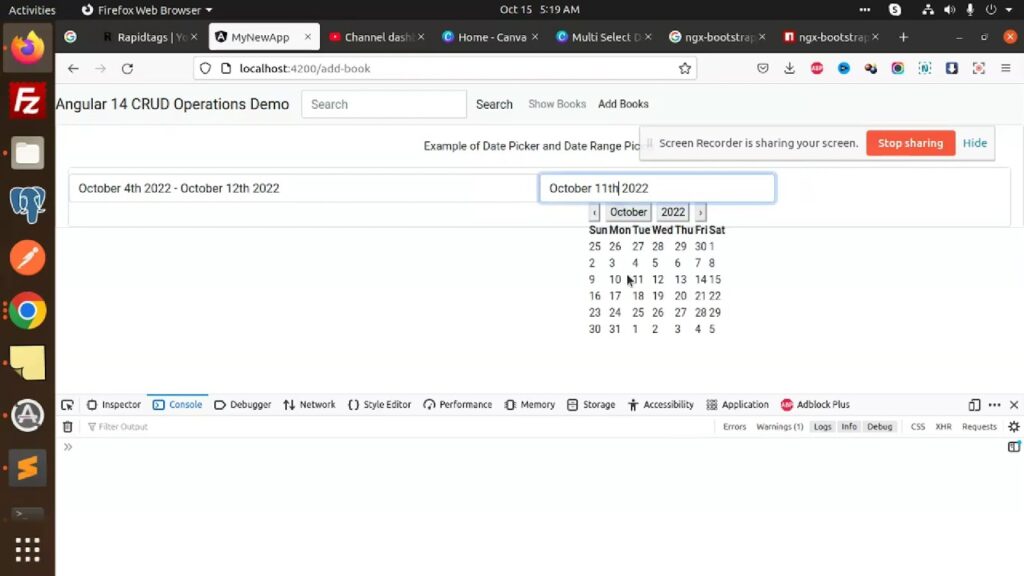
Master the Angular Date Range Picker: Comprehensive Installation and Usage Guide
Angular’s Date Range Picker, ob-daterangepicker, is a powerful tool worth mastering. This thorough guide aims to provide a detailed, step-by-step tutorial on how to successfully install and utilize this tool in your Angular projects.
Detailed Installation Process
First and foremost, it is important to install ob-daterangepicker. Here are some methods to do it:
Using Bower:
Bower is a popular package manager that can handle installation of the Angular Date Range Picker. Here is how you can use it:
bower install –save ob-daterangepicker
This command will install ob-daterangepicker and save it as a dependency in your project.
Using npm:
Alternately, you can use npm (Node Package Manager) to install ob-daterangepicker. npm is a prevalent choice among developers due to its simplicity and wide range of packages.
npm install –save ob-daterangepicker
Like Bower, this command will install ob-daterangepicker and also save it as a dependency in your project.
Comprehensive Usage Guide
After installation, you’ll need to properly set up ob-daterangepicker to use it in your Angular applications.
Adding Directive JS & CSS:
Firstly, add the ob-daterangepicker’s JS and CSS to your index.html file. This is an essential step to ensure the correct functioning of the date range picker.
<link rel="stylesheet" href="bower_components/ob-daterangepicker/dist/styles/ob-daterangepicker.css">

<script src="bower_components/ob-daterangepicker/dist/scripts/ob-daterangepicker.js"></script>
Injecting obDateRangePicker to Your Main Module:
Next, inject the obDateRangePicker into your main Angular module. This allows your application to recognize and use the date range picker.
angular.module('yourModule', ['obDateRangePicker'])Replace ‘yourModule’ with the name of your actual Angular module.
Implementing the ob-daterange-picker Directive:
Finally, add the ob-daterange-picker directive to your HTML files where it’s required.
<ob-daterange-picker></ob-daterange-picker>With these steps, you’ll be all set to use the power of Angular’s Date Range Picker in your applications. Whether you’re scheduling events, filtering dates, or building a calendar-based function, the ob-daterangepicker will no doubt prove a valuable asset.
Configuring Angular’s Date Range Picker
Incorporating the Angular Date Range Picker involves setting specific configurations through the ob-daterange-picker directive attributes. Read on to explore an array of configurations:
Setting the Range
The purpose of the range attribute is to define the initial range that is displayed on the date-range-picker. Any updates to the range are automatically reflected in this object.
- Type: object { start: Moment | String, end: Moment | String };
- Default: { start: moment(), end: moment() }
Bring into mind that both the start and end parameters need to be of the same type. If they are strings, the date’s format must be specified, for example:
JS:
this.range = { start: '27-08-2014', end: '30-08-2014' };

this.format = 'DD-MM-YYYY';

HTML:

<ob-daterangepicker range="vm.range" format="vm.format"></ob-daterangepicker>
Formatting the Date Range
If specified, the format attribute implies that the range object’s start and end attributes are string types.
- Type: String;
- Default: undefined.
Various formats are available to be used, which can be found here.
Setting the Minimum Date
The min-day attribute is used to specify the earliest selectable date. Dates preceding this will be disabled.
- Type: String or Moment;
- Default: undefined.
Important: If the attribute is a string, the day’s format must be provided.
Determining the Maximum Date
Opposite to the min-day, the max-day attribute sets the latest selectable date. Any dates following this will be disabled.
- Type: String or Moment;
- Default: undefined.
Note: Similar to the min-day, if the attribute is a string, the day’s format needs to be provided.
This comprehensive guide will help you navigate through the configuration of the Angular Date Range Picker. Making good use of these settings will allow this valuable tool to be adjusted to perfectly match your specific needs and requirements. Also, unlock the power of Angular DateRangePicker for seamless date selection. Streamline your app’s date handling effortlessly. Discover how!
Delving Deeper into Configurations: Calendar Customizations & Callbacks
Given that Angular’s Date Range Picker is highly configurable, understanding its diverse attributes is key to utilizing it effectively. Each configuration attribute allows customization to suit specific application requirements.
Accommodating Sequential Months with ‘linked-calendars’
This feature influences how the two calendar months are displayed and navigated. When enabled, the two months shown are always sequential, i.e., April and May. Clicking the navigation arrows moves both months together.
However, when disabled, the two calendars operate independently and can display any month or year.
- Type: Boolean;
- Default: true.
Customizing the Week’s Start Day with ‘week-start’
By default, the week starts on Sunday. However, this attribute lets you define any day as the start of the week. It accepts the following values:
‘su’, ‘mo’, ‘tu’, ‘we’, ‘th’, ‘fr’, ‘sa’
- Type: String;
- Default: ‘su’.
Tip: Use this feature to accommodate international conventions where weeks start on Monday.
Personalizing Weekdays’ Names with ‘week-days-name’
This attribute lets you customize the display names of week days. It could be beneficial for multilingual applications.
- Type: Array<String>;
- Default: [‘Sun’, ‘Mon’, ‘Tue’, ‘Wed’, ‘Thu’, ‘Fri’, ‘Sat’].
Employing Callbacks with ‘on-apply’
This function triggers when a date range is applied. Use this to perform any necessary actions upon range selection, like updating UI or sending a request to the server.
- Type: Function(start,end);
- Default: undefined.
The function requires the start and end parameters.
Example:
JS:
this.onApply = function(start, end) { ... }

HTML:

<ob-daterangepicker on-apply="vm.onApply(start, end)"></ob-daterangepicker>
Adopting Automatic Application with ‘auto-apply’
When enabled, this attribute hides the apply and cancel buttons. It automatically applies a new date range as soon as two dates or a pre-defined range is selected.
- Type: Boolean;
- Default: false.
Insight: Use ‘auto-apply’ for a smoother user experience where immediate range selection is beneficial.
In summary, these configurations empower you to tailor the Angular Date Range Picker to your specific needs, providing better control over its behavior and appearance.
A Closer Look at Angular Date Picker Positioning Configurations
The Angular Date Range Picker is a flexible tool that allows customization in terms of its placement relative to the directive. CSS classes manage the positioning of the picker. These configurations can greatly influence the look and feel of your application, enhancing the overall user experience.
Adjusting Vertical Position with ‘drops’
The ‘drops’ configuration determines whether the date picker pops up above or below the directive.
- Type: CSS Class;
- Default: down;
- Options: up, down.
The default setting is ‘down’, which means the picker will drop down from the directive. If you want the picker to appear above the directive, adjust the CSS class to ‘up’.
Example:
<ob-daterangepicker range="vm.range" class="up"></ob-daterangepicker>Note: Be mindful of the placement of your directive on the page to ensure there is enough space for the date picker to appear without being cut off.
Choosing Horizontal Alignment with ‘opens’
The ‘opens’ configuration allows you to adjust the horizontal alignment of the picker relative to the directive.
- Type: CSS Class;
- Default: left;
- Options: right, left, center.
By default, the picker appears to the left of the directive. However, you can modify the alignment to be either to the right or centered based on your requirements.
Example:
<ob-daterangepicker range="vm.range" class="right"></ob-daterangepicker>Professional Tip: Consider the layout of your page and the visual flow when deciding on the best horizontal positioning for the date picker.
Proficiently Positioning Your Picker
The ‘drops’ and ‘opens’ configurations can be used in combination to achieve optimal positioning. By fine-tuning these settings, you can precisely control where and how your date picker appears, providing a smoother and more intuitive user experience.
Example:
<ob-daterangepicker range="vm.range" class="up center"></ob-daterangepicker>In essence, understanding and manipulating these configurations effectively can significantly enrich the look and feel of your application, making it user-friendly and visually appealing.
Contributing to the Angular Date Range Picker Project
The Angular Date Range Picker is an open-source project that thrives on the contributions of its user community. If you’ve identified a bug to fix or an improvement to implement, your contribution is always welcome. Here’s a step-by-step guide to making a meaningful contribution:
Step 1: Fork and Branch
Begin by forking the Angular Date Range Picker project to your personal GitHub account. From there, create a new branch dedicated to your contribution. Be sure to give the branch a descriptive name that reflects the nature of your fix, for example: updated-feature or bug-fix-name.
Step 2: Commit Your Changes
Once you’ve made your changes in the new branch, commit them. Remember, any fixes or improvements should be accompanied by corresponding tests to verify their functionality. Always aim to deliver quality, tested code.
Step 3: Open a Pull Request
After committing your changes, it’s time to open a pull request. The pull request is the mechanism through which your contributions will be reviewed and potentially merged into the project.
In your pull request message, make a reference to the initial issue that prompted your changes (e.g. fixes #issue-number). Craft a clear and concise title and description that clearly articulates what was fixed or improved.
Step 4: Await Merging
Patience is key! Your contributions will be evaluated and, if deemed beneficial to the project, will be merged.
Remember:
- High-quality contributions are much appreciated and have a higher likelihood of being accepted;
- Detailed issue reporting, code commenting, and pull request descriptions aid understanding and accelerate the review process.
Through these steps, you can contribute wisely to the Angular Date Range Picker project and improve it for the entire community!
Conclusion
In conclusion, the Pure Angular Date Range Picker exemplifies the innovation and utility Angular brings to the web development arena. By offering a user-centric, efficient means for selecting date ranges, it enhances the functionality of applications while simplifying complex tasks for developers. As we navigate the evolving demands of web applications, tools like the Pure Angular Date Range Picker not only streamline development workflows but also elevate the user experience to new heights. This exploration underscores the importance of choosing robust, versatile components in building responsive, user-friendly web applications, reaffirming Angular’s status as a pivotal framework in the development community.