Angular Datepicker is a powerful tool in Angular JS for handling date and time inputs in a user-friendly manner. With this tool, developers can provide a comprehensive view of year, month, date, hours, and minutes, enhancing the user interface of any web application.
Explore how Angular’s datepicker can be seamlessly integrated into your project, and then delve into our latest article that guides you through the process of implementing file uploads using Angular.
Prerequisites for AngularJS Datepicker Directives
Before you start using Angular Datepicker, make sure you have the following requirements fulfilled:
- Angular v1.2+ : The minimum Angular version needed to run the Datepicker;
- MomentJS : A JavaScript library to parse, validate, manipulate and display dates and times;
- Moment Timezone : This is optional and is required only if you are considering incorporating timezones in your application.
Installation Process
Installation of Angular Datepicker is a straightforward process. You can install it either via Bower or npm.
- Bower: To install using Bower, run the following command: bower install angular-datepicker –save;
- Npm: Or, to use npm, use this command: npm install angular-datepicker –save Once the installation is through, add the JavaScript, CSS, and Moment files to your webpage. Remember to include the datePicker module in your webpage for the Datepicker to work.
Once the installation is complete, incorporate the JavaScript, CSS, and Moment.js files into your webpage. Then, integrate the ‘datePicker’ module onto your site.
Enhanced Capabilities
The enhanced version of the Angular datepicker offers an expanded range of functionalities.
Flexible Timezone Compatibility
This directive is designed to operate seamlessly with both defined and undefined timezones. Users can specify a timezone by using the ‘timezone’ attribute within the datepicker. In cases where a timezone is not specified, the system defaults to using the local timezone settings. Here are examples of implementation:
Without specifying a timezone:
<div date-picker></div>For a specific timezone (e.g., London, UK):
<div date-picker timezone="Europe/London"></div>For a specific timezone (e.g., Hong Kong, CN):
<div date-picker timezone="Asia/Hong_Kong"></div>Date Selection Boundaries:
The ‘min-date’ and ‘max-date’ attributes set permissible date selection ranges. Unlike the original attributes they supersede, these new attributes prevent the selection of dates outside the specified range rather than simply flagging them as invalid inputs. When a date falls outside the established bounds, it becomes unselectable within the picker.
To specify a minimum date:
<input date-time min-date="minDate">To specify a maximum date:
<input date-time max-date="maxDate">To set both minimum and maximum dates:
<input date-time min-date="minDate" max-date="maxDate">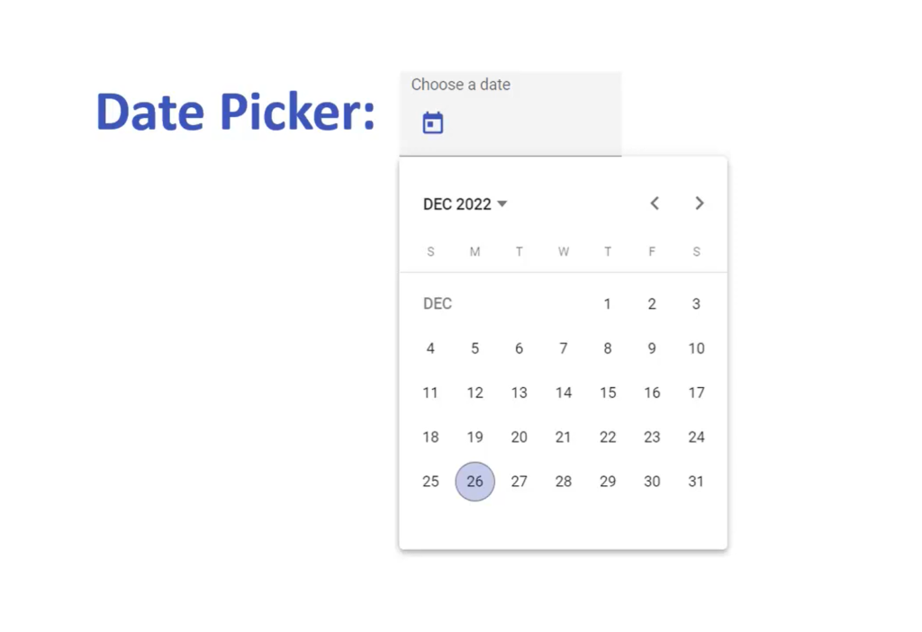
Date Format Specification for Input Fields:
You can specify a custom date format for input fields using the “format” attribute. This designated format dictates how the date is presented within the input field. In the absence of a custom format, the system reverts to utilizing a standard default format. For further details, consult the format options section.
Example:
<input date-time format="yyyy-MM-dd HH:mm">Event Handling for Date Changes:
To trigger a specific function upon the alteration of the date within the picker, incorporate a “date-change” attribute with the desired function’s name as its value. This setup ensures that the specified function is executed whenever there is a change in the date selection.
Example:
<input date-time date-change="changeDate">Dynamic Configuration Updates for Date Pickers

Date pickers can be dynamically updated with new configurations through broadcasting an event from the parent scope. The configurations that can be modified include:
- minDate: Sets the earliest date that can be selected. It will be inactive if this value is not provided;
- maxDate: Defines the latest date that can be selected. It becomes inactive if this value is not provided;
- minView: Establishes the minimum zoom level for date/time selection. It is inactive without a value;
- maxView: Determines the maximum zoom level for date/time selection. It remains inactive without a value;
- view: Specifies the default zoom level for date/time selection. Reverts to a default setting if not provided;
- format: The format string for displaying dates in the input field. Defaults to a standard format if unspecified.
For additional information on format specifications, please refer to the format options section.
Please note, these updates cannot be applied directly via the date-picker directive but should be implemented on a date-time input field.
The view, minView, and maxView configurations can be set to various levels, including year, month, date, hours, and minutes.
To target specific pickers for updates, use their ID attributes. If a picker with the corresponding ID exists, it will be updated accordingly. Both single IDs and arrays of IDs are supported for targeting multiple pickers simultaneously.
Initialize Picker with an Identifier
<input date-time id="pickerToUpdate">Updating a Single Picker
To update an individual picker, you can broadcast an event as follows:
$scope.$broadcast('pickerUpdate', 'pickerToUpdate', {

    format: 'D MMM YYYY HH:mm',

    maxDate: maxSelectableDate, // Can be a moment object, date object, or a string that moment.js can parse

    minView: 'hours',

    view: false // Fallback to default view setting

});
Updating Multiple Pickers
For updating several pickers at once, use the following approach:
$scope.$broadcast('pickerUpdate', ['pickerToUpdate', 'secondPickerToUpdate'], {

    format: 'lll'

});
Conclusion
Angular Datepicker stands as an invaluable tool for developers seeking to elevate the user experience in their web applications. Its capabilities extend beyond mere date and time input, offering a host of customizable features, timezone support, and intuitive design elements. By mastering these features and understanding how to leverage them, developers can dramatically enhance the functionality and the visual appeal of their applications. With this comprehensive guide, you have the necessary knowledge and skills to start integrating and making the most of Angular Datepicker in your web development projects.